It's a work in progress but I think it's getting there! And yes, I will be changing the ugly header.
Yay or nay on the new look? Is it hard to read the text? Be honest with me people.
About Me
- emlouisa
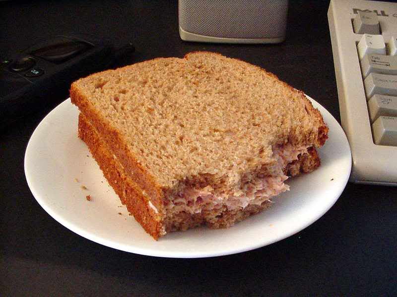
- My name is Emily and yes that is a sandwich. I spend most of that blessed solitude called naptime right here in front of the computer, blogging and ingesting unhealthy foods, the likes of which would make any nutritionist gasp in horror. I live in Idaho and am LDS (Mormon). I am in my late twenties, and have been married to Greg for seven blissful years. We have two children, both boys. A-Boy is 2 1/2 and Mini-Man is 12 months. I am a stay at home mom and usually love it. Usually. Most days.
22 comments:
I like it! My husband would love it. He keeps trying to use that color scheme on professional sites. I'm not such a fan there, but it's perfect for a mommy blog.
ps, blogger may decide to have this show up 3 times.
I like it. The text is a little bit hard for me to read, but I'm also practically blind in one eye so that that FWIW. :)
I like the colors, but I do find the text difficult to read. Maybe you could take it just a value or two darker?
I like it, too. I agree that the text would be a tich more readable in a darker shade. (Or a lighter shade of background) Your sandwhich picture makes me smile. :)
I agree, text is a little hard to read, but I like the colors.
When I use the scrolly thing (technical term) on my mouse, it gives me vertigo, but I think that's a personal problem.
Love it.
I like it as well. And ditto to possibly making the text just a shade darker? But I love it WAY better than white text on black (or dark). I think it's my astigmatism, but I seriously have the hardest time reading those blogs. I see lines for a good hour after :)
I love the turquoise blue! One of my favorites so I quite like your new look.
oh wow. I can read it ok. Not a fan of the bluey colour. Love the background though.
I like it! You must share with me how you did it!
m'kay. Is that color orange easier to read??
Thanks for all your input!
While I'm being honest...
your new look reminded me that I should get my Senior Pictures out to scan. I was totally wearing a turquoise/teal skort and a SILK peach blouse. Jealous? (go '92!)
Very nice.
The darker oragne does make it easier! Great look.
I like it A LOT!I think it is cool and retro.
Looks good Em! :)
I like it! Very retro! not hard to read at all!
Honesty? The background is making me a little dizzy. Maybe that's just me though.
like it a lot. and i don't have a hard time reading the text at all.
It looks great, Em. And tuna is healthy!!! Lol.
I haven't been around all weekend. I love the darky orange color. I like the contrast of your page now too. If you EVER figure out how to change the size of your title, will you e-mail me. I am doing a little redecorating myself and can't figure that part out.
Hence the fire-hydrant. Because most days I feel like the hydrant and NOT the dog.
Post a Comment